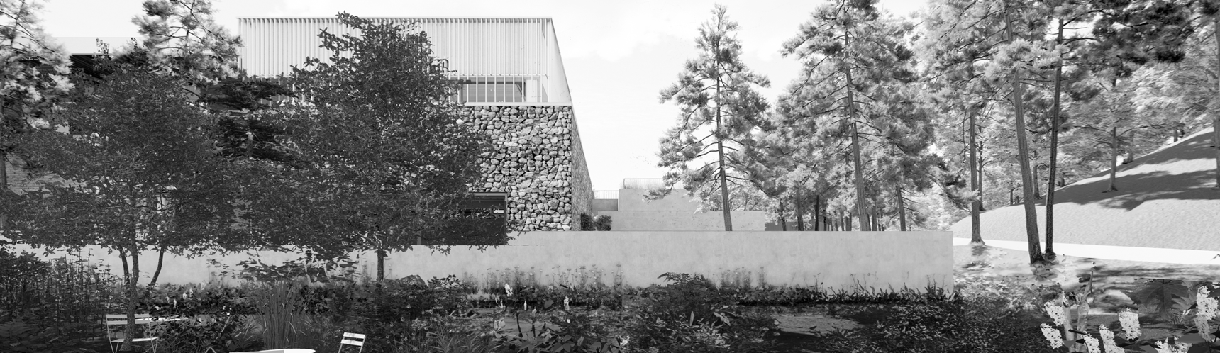
<About the Name>

A house open to shape what’s next —
to envision new beginnings, cultivate fresh ideas, and imagine a new Busan.
A place where rest, encounters, and inspiration flow across boundaries —
DOMOHEON is a space of open possibilities
to envision new beginnings, cultivate fresh ideas, and imagine a new Busan.
A place where rest, encounters, and inspiration flow across boundaries —
DOMOHEON is a space of open possibilities
<Symbol Mark>

The DOMOHEON Brand Identity reflects the space’s layered history while symbolizing an open, inclusive hub where people come together to learn, grow, and co-create culture.
Its geometric design is composed of the Korean consonants in “DOMOHEON” (ㄷ, ㅁ, ㅎ). The square shapes formed by ㄷ and ㅁ represent the weight of history and the foundation of stability. The circle formed by ㅎ signifies civic participation, communication, and connection between people.
Together, these elements capture DOMOHEON’s essence as a space for healing and growth — a place where learning leads to cultural innovation and where the future unfolds through shared experiences.
<Korean Signature>

<English Signature>
